Read Time
10 min
Team Size
Me - Designer
Creative Director
Team Lead Designer
Timeline
Aug 2025 – Dec 2025
Tools Used
Figma

Building the Common Design Components Library Documentation

On Citi’s Sales & Marketing Design team, I independently led the documentation of our internal Common Design Components library.

This project focused on formalizing this library into a clearly structured, well-documented system that could support cross-team adoption. An additional challenge was ensuring design components were accurately documented across two distinct visual themes: legacy Citi branding and the newer Citi branding.

I assessed and standardized 30 reusable design components (46 total variations) and built a documentation framework that improved clarity, consistency, onboarding efficiency, and long-term scalability. The final output included over 230 structured documentation sections and created a structured foundation that can be used for future additions to the library.
Problem
Solution
How might we transform an inconsistently documented component library into a clear, scalable system that designers across teams could easily understand and use?
I standardized the components and built a structured documentation framework that created a single source of truth for implementation and usage.
Final Solution
Over 5 months, I not only established the first comprehensive source of truth for the Common Components library, I cleaned up inconsistencies within the components themselves.

This in turn:
  • Reduced onboarding friction for new designers
  • Preserved team internal knowledge in a structured format
  • Increased design consistency across pages
  • Improved cross-team adoption of reusable components
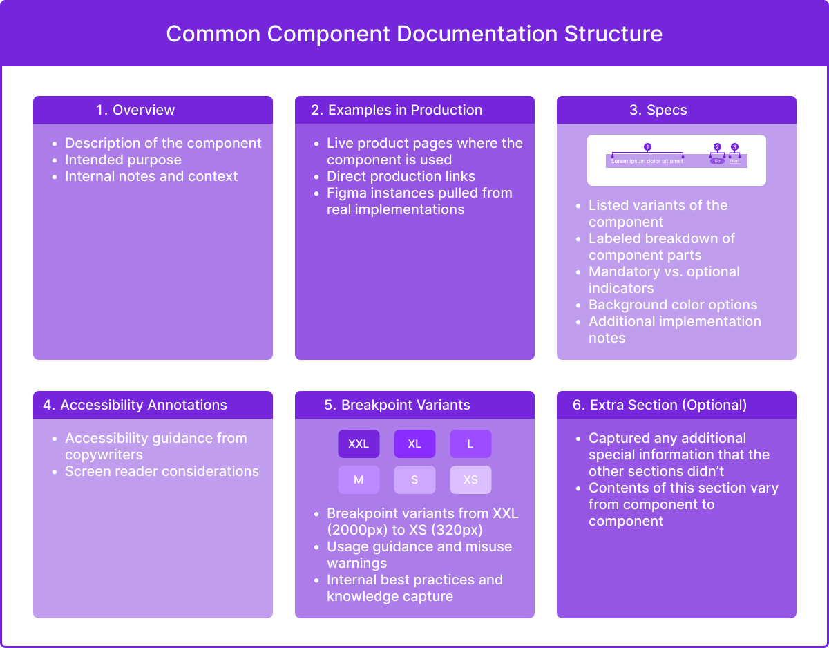
Each component’s documentation consisted of 5 main sections: Overview, Examples in Production, Specifications, Accessibility Annotations, and Breakpoint Variants.

Because this project was created as an internal company tool protected by confidentiality policies, I’m unable to share the final product.

The visuals shown here are reconstructed mockups representing the documentation:
1. Overview
As the first section, the overview provides a high-level summary of the component, including its purpose and when it should be used.
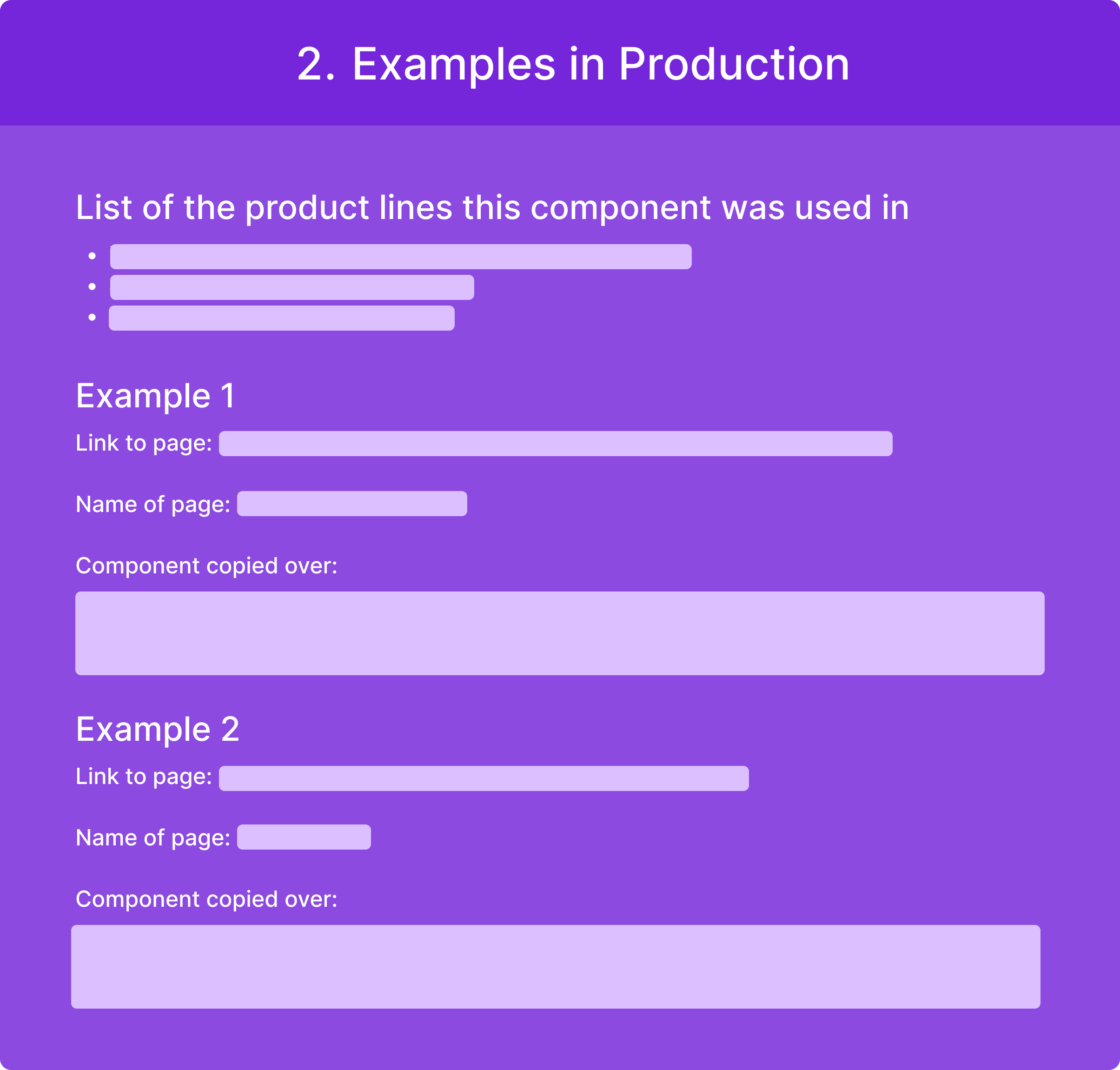
2. Examples in Production
This section shows where and how the component was used in production.

The component from that page is then copied over here so designers and developers can examine how it was used.
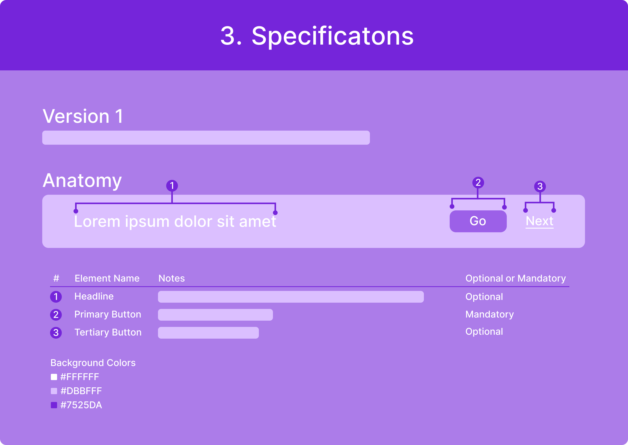
3. Specifications
Breaks the component down into labeled parts and defines each element’s structure.

It includes internal knowledge notes of how each part should be used (e.g. character counts, special use cases, etc.)

Each of the component’s versions is broken down in detail.
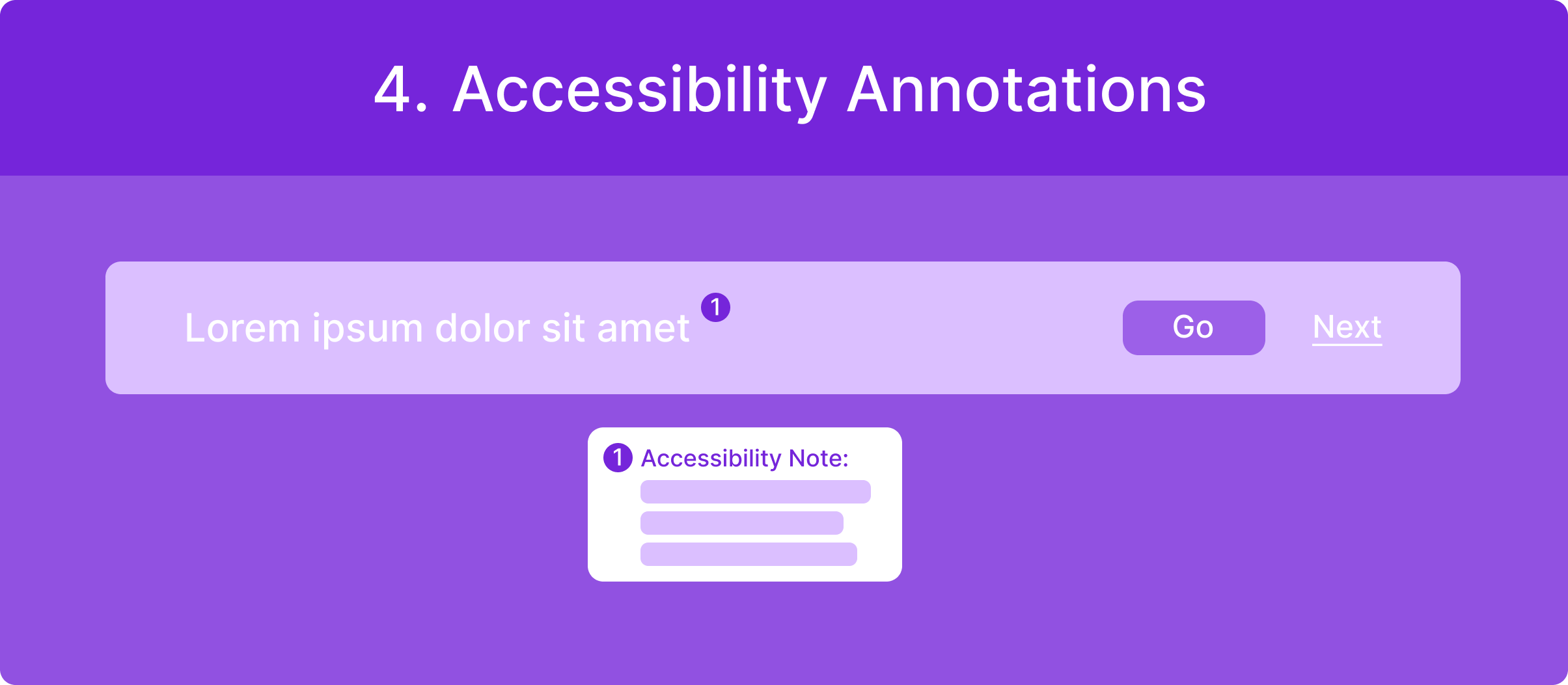
4. Accessibility Annotations
Documents accessibility considerations and guidance to support inclusive and ADA compliant component usage.
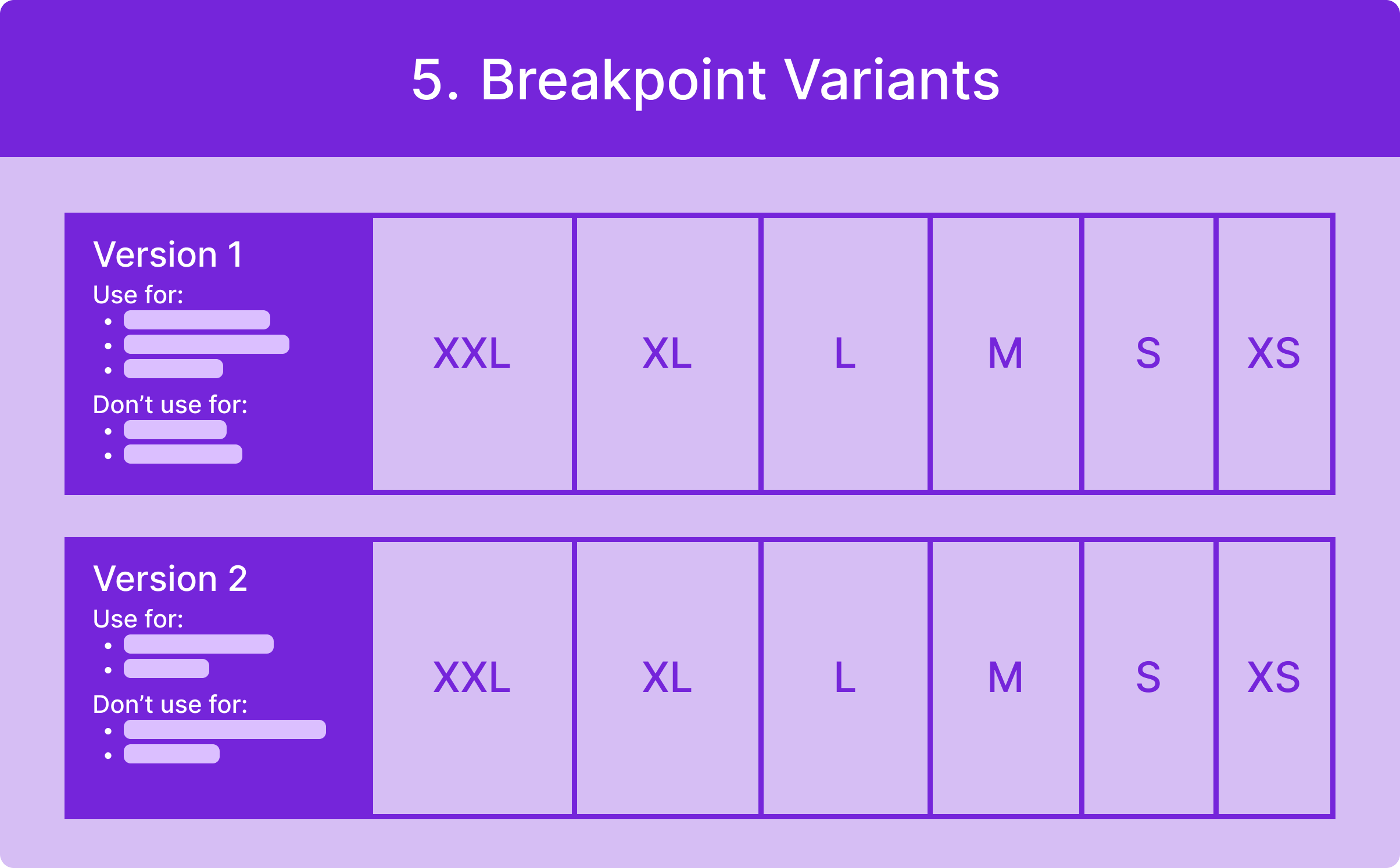
5. Breakpoint Variants
Because components adapt across screen sizes, this section show its behavior at every breakpoint from XXL to XS.

This section also documents internal knowledge and usage guidance that had previously lived only within the team.
6. Extra Section (Optional)
Captured any additional information that did not fit within the standard documentation sections.

The contents of this section varied by component and were used to document unique considerations, variations, or contextual details.
Context
Within the Sales & Marketing Design team, our team relied on a shared set of reusable UI elements known as “Common Components”. These components were used across marketing and account opening experiences to ensure consistency, speed up production, and reduce redundant design work.

Common Component examples include:
  • Heroes
  • Frequently Asked Question section
  • Sticky Headlines
  • Legal disclosure footer area

Over time, the library had grown to 30 core components, which collectively produced 46 theming variations stemming from legacy Citi branding and the newer Citi branding. However, documentation had evolved informally. Knowledge about usage rules, spacing standards, breakpoints, and accessibility considerations largely lived within the current team rather than in a centralized, structured source of truth.

As collaboration expanded across teams and new designers onboarded, gaps in clarity and consistency created confusion.
Looking under the hood...
In order to make comprehensive documentation, I first knew I had to really understand each component. As I began reviewing the components in detail, I uncovered inconsistencies in naming conventions, spacing, and structural patterns that required standardization before proper documentation could be established.
Key component issues included:
  • Spacing inconsistencies across components
  • Components not performing reliably because they weren’t fully stress-tested
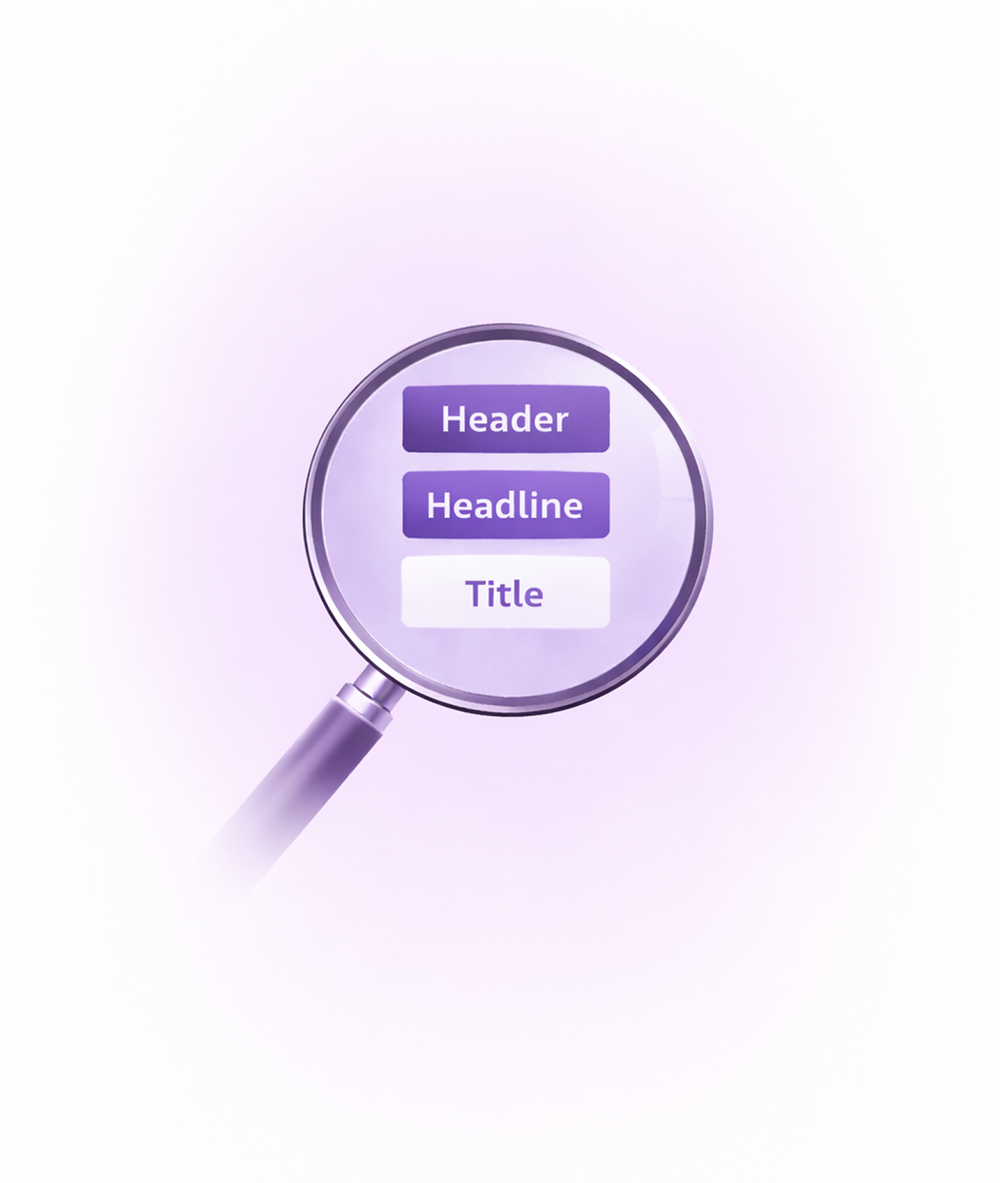
  • Inconsistent naming conventions (e.g., “header”, “headline”, and “title” used interchangeably)

In addition, I found that the existing documentation was messy, incomplete, and difficult for anyone outside the internal team to use effectively.

Key documentation issues included:
  • Breakpoints not clearly outlined
  • Critical implementation knowledge stored informally
  • Historical context and proper usage guidelines existing only within the knowledge of the internal team rather than in written documentation
  • No uniform documentation structure
  • Accessibility annotations scattered or undocumented

As a result:
  • New team members faced onboarding friction
  • Cross-functional partners struggled to confidently reuse components
  • Internal team knowledge risked being lost
Got to work.
1. Standardizing the System
Before documenting, I ensured the components themselves were consistent. Rather than documenting these issues as they were, I addressed them directly to establish a reliable foundation.

Throughout the process, I corrected inconsistencies wherever they appeared. This meant continuously refining the components alongside the documentation work to ensure the system remained accurate and dependable.

To create clarity and consistency, I did the following:
  • Aligned naming conventions across all elements
  • Standardized naming terminology
  • Corrected inconsistent spacing patterns
  • Consolidated unclear or redundant variations

This created a clean, reliable baseline for documentation.

Although resolving these issues was not explicitly critical, I took ownership of standardizing them to ensure the system itself was consistent before documenting it. Addressing these foundational inconsistencies elevated the quality and reliability of the library.

By refining both the components and their documentation, I ensured the final system was not only organized, but structurally sound and scalable.
2. Designing the Documentation Framework
Rather than adding scattered notes, I created a structured and repeatable documentation model. I reviewed documentation structures from other component libraries within Citi to see how teams were organizing similar systems. I also leveraged Citi’s internal AI assistant to explore additional ideas and recommendations for structuring design system documentation.

Using these insights, I developed a framework tailored to our team’s needs.

Each of the 46 components' themed variations included 5-6 core sections:
Results
46
COMPONENT THEMING VARIATIONS
x
5+
SECTIONS PER VARIATION
=
230+
SECTIONS COMPLETED
  • Reduced onboarding friction for new designers, enabling faster contribution to projects and lowering the ramp-up cost for new hires
  • Boosted cross-team adoption of reusable components, increasing efficiency and reducing duplicated work across product and marketing teams resulting in productivity
  • Increased design consistency across marketing experiences, strengthening brand perception and improving customer trust and engagement
  • Prevented redundant component recreation, reducing design and development hours, resulting in lower operational costs
  • Preserved institutional knowledge in a structured format, mitigating risks of misuse
  • Established the first comprehensive source of truth for the Common Components library, accelerating time-to-market production

Additionally, because I had recently onboarded to the team, I was uniquely positioned to identify documentation gaps that long-tenured members no longer noticed. I intentionally structured the documentation to answer the exact questions I had when first learning about the Common Component Library, making it intuitive for future hires and partner teams.

This project demonstrated my skills in systems thinking, organization, advanced Figma proficiency, and proactive problem-solving within a large enterprise environment.